How to Use College ROI
A walkthrough of the site for parents, students, and counselors. Both calculators, every browse page, and how to read the results.
Why we built it
We kept running into the same problem in every family conversation, every counselor meeting, and every parent night. People were making a six-figure investment decision with worse information than they would tolerate for a used car. The brochures showed alumni in lab coats. The campus tour showed climbing walls. The financial aid letter showed one year of price. Nobody showed the only thing that mattered after graduation, which is whether the bet paid off.
So we built the calculator we wished families had when we were sitting across from them.
The site pulls public data from the U.S. Department of Education, the Census Bureau, and the Bureau of Labor Statistics. It runs that data through the kind of financial model a CFO would use to evaluate any other investment of this size. The output answers one question in four different ways. Is this college, for this major, at this price, with this starting salary, worth the money over a working lifetime.
If you remember nothing else from this page, remember three things.
- The model takes the time value of money seriously. A dollar paid in tuition at age 18 is not the same as a dollar earned at age 45.
- The default comparison is against a high school graduate, not against another college graduate. Most other ROI tools quietly compare colleges to colleges, which hides the question of whether college was the right call at all.
- The headline number, Lifetime Value Added, is the discounted total of after-tax earnings minus all costs over the working career, measured against that baseline. Positive means the degree paid for itself. Negative means the family would have been better off financially without it.
That is the whole story. Everything else on the site is a different cut of the same calculation.

Three doors in
The site has three doors in. Pick the one that fits.
Start with the Guided Interview. You have a specific kid, a short list of colleges, a number from the financial aid office, and a feeling something is off. The Guided Interview lets you put all of those into one model in about ten minutes and see whether the offer clears the bar.
Start with the Major page for the field you are considering. The earnings trajectory and the underemployment rate matter more than the brochure you got in the mail. Then run the Guided Interview against your short list.
Start with the State page for your state. The aggregate view shows, for each credential level, how many institutions in your state produce positive lifetime value at each price point. That is the context your scripts have been missing.
We walk through each tool in turn below.
The Standard Calculator
The Standard Calculator is the back-of-the-envelope tool. One screen, eight inputs, four numbers out.
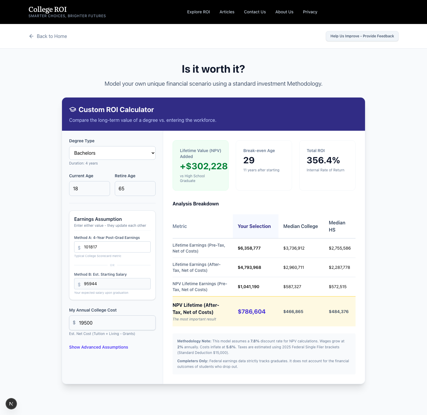
The inputs are grouped into three boxes. On the left you enter your degree type, your current age, your retirement age, the annual cost of college, your expected starting salary, and your years in school. Each has a sensible default, so you can start from a working model and change one assumption at a time.
The four numbers
Lifetime Value Added (NPV) is the dollar number, in today's money, that the degree adds or subtracts compared to skipping it. A positive number means the degree paid for itself. A negative number is real money lost.
Total ROI restates that same finding as a percentage of what you put in.
Break-Even Age is the age at which the cumulative dollars from the degree finally pull ahead of the cumulative dollars from working as a high school graduate from age 18. If your model says the break-even age is older than your planned retirement age, the degree never paid back.
Analysis Breakdown shows your selection next to the national median college graduate and the national median high school graduate so you can see whether your model is in the middle of the pack or out at one of the edges. The table reports both a pre-tax and an after-tax row for each comparison. Read the after-tax row. The government takes its share before you spend a dollar, and that share is often the difference between a degree that pays back and one that does not.
The Earnings Assumption box
Two ways to enter the same expected outcome. Method A asks for the 4-Year Post-Grad Earnings figure that the College Scorecard reports, which is what alumni at this school actually earn four years after they finish. Method B asks for the starting salary you expect on graduation day. Enter whichever number you have. The other auto-fills, with three years of 2.0% wage growth in between, so the two stay consistent.
Advanced Assumptions
Hidden until you click it. Lets you change the wage growth rate, the discount rate, the tuition cost inflation rate, and an optional state tax adjustment. The defaults are 2.0% wage growth, 7.8% discount rate, and 5.6% tuition inflation. We use the actual 2025 federal tax brackets (or optionally 2026) and FICA at 6.2% for Social Security up to the wage base and 1.45% for Medicare. State taxes are not included by default. If you live in a state with income tax and want to factor it in, enter a small percentage in the state tax field. We recommend leaving it at zero.
If any of those numbers feel high or low, change them and watch what happens. The point of the calculator is not to win an argument. The point is to let you see how sensitive the answer is to the assumptions you make.
The Guided Interview
The Guided Interview goes deeper. Same math, six steps, real institutional data layered in where it counts.

Step 1, Personal Profile
You set the starting age, the retirement age, and what we call the choice context. The choice context is the single most important decision in this whole interview, and most people speed through it.
First Higher Education Choice compares everything you build against a high school graduate. This is the right setting for a parent or student deciding whether to go to college at all, or which college.
Graduate or Professional Degree compares everything against a bachelor's graduate already in the workforce. This is the right setting if undergrad is already done and the question is whether a master's or a professional degree adds value on top of what the bachelor's already delivered.
The wrong setting gives you a number that looks plausible and means nothing.
Step 2, Opportunity Baseline
The salary the model assumes you would have earned without the degree. For the first-higher-education context, the default is $35,872, the national median wage we use at age 22, which is the first year after a four-year degree starting at 18. For the graduate context, the default is $56,943, the equivalent bachelor's number. The calculator adjusts both up or down when you change the starting age.

If you already have a job, or if your kid has a clear non-college path that pays more than the national median, use the Customize option. A student who would have walked into a $52,000 trade apprenticeship at 18 is not coming out ahead with a four-year history degree at the median outcome. The baseline you choose determines whether the model tells you that or not.
Step 3, Higher Ed Pathways
You pick which credential levels you want to model. Certificate, associate, bachelor's, and so on. You can pick more than one and see them side by side at the end.

For each pathway, you set the program duration in years, whether the student works while enrolled, the annual net cost, and a preferred field of study. When you search and select a major, the model pulls a national median starting salary for that field and drops it into the Expected Starting Salary field. Treat that number as a starting point, not an answer. The next step refines it with institution-specific data.
Step 4, Institution Selection
This is where the calculator stops being a back-of-the-envelope tool and starts being something useful for a real decision. You search for a specific college and add it to the pathway.

Once a college is added, the card displays four data points pulled from the College Scorecard. The graduation rate. The share of graduates earning more than the typical high school graduate. The median earnings four years after graduation for students who actually finished. The median earnings ten years after enrollment for everyone who started, including the students who dropped out.
That last distinction matters more than any number on the page. The four-year completer salary tells you what the degree is worth if your student finishes. The ten-year enrollee salary tells you what the degree is worth if your student is statistically average and might not. The gap between those two is the Completion Premium, and the card highlights it for you. At a school where the gap is large and the graduation rate is low, you are buying a coin flip, not a credential.
You also choose which annual cost the model uses. Net Price is the sticker minus the average grant aid awarded at that school. Sticker Price is the published price. Zero Cost is what you would model if a full scholarship is on the table. Pick the one that matches the offer in your hand.
Step 5, Financial Assumptions
This is the panel where readers used to investor-grade analysis will feel at home and everyone else can leave the defaults alone.

You can change the three economic rates the model relies on, and you can enter an optional state tax adjustment. The state tax field defaults to zero. State income tax codes have brackets, exemptions, and deductions this model does not replicate, so we do not pretend to compute a real state return for you. If you want to see how a small state tax assumption affects your NPV, enter a number lower than your state's headline rate. We recommend leaving it at zero. Federal taxes are computed using the 2025 single-filer brackets (default, matching the book) or 2026 single-filer brackets for every pathway. The model projects a single earner, so single-filer brackets are the honest comparison even if your household files jointly.
Step 6, Guided Outcomes
This is the payoff.

Each pathway you modeled gets a row with the duration, the estimated starting salary, the total net cost, the NPV after tax, the estimated ROI, and the break-even age. The horizontal bar at the top is the visual we recommend reading first. It places each pathway on a left-to-right scale running from negative value (the family lost money) through the baseline (the family broke even against the alternative) to positive value (the family came out ahead).
The NPV in the table is already an after-tax number. The calculator has run the federal brackets, FICA, and any optional state tax adjustment on every year of projected earnings before discounting them back to today. The column is labeled NPV After-Tax instead of just NPV for that reason.
Below the table, the Dynamic guided evaluation callout reads back every assumption the model just used. Starting age, retirement age, working window, wage growth, discount rate, federal tax table, state tax treatment. All of it in plain language. Read it every time. If any of those assumptions look wrong for the family you are modeling, back up to Step 5 and adjust before you treat the headline number as an answer.
If a pathway shows a negative NPV in this screen, that is not a rounding error. That is the model telling you, with real data from a real institution at a real price, that this specific bet on this specific student is more likely to destroy wealth than build it. We have sat in enough family living rooms to know how unwelcome that finding is. The families who saw it early were the ones who avoided the worst outcomes.
The data pages
The two calculators do the work of evaluation. The browse pages do the work of discovery.
College pages
Click any college name on the site and you land on its scorecard. Everything we know about that institution, on one screen, organized for fast scanning.
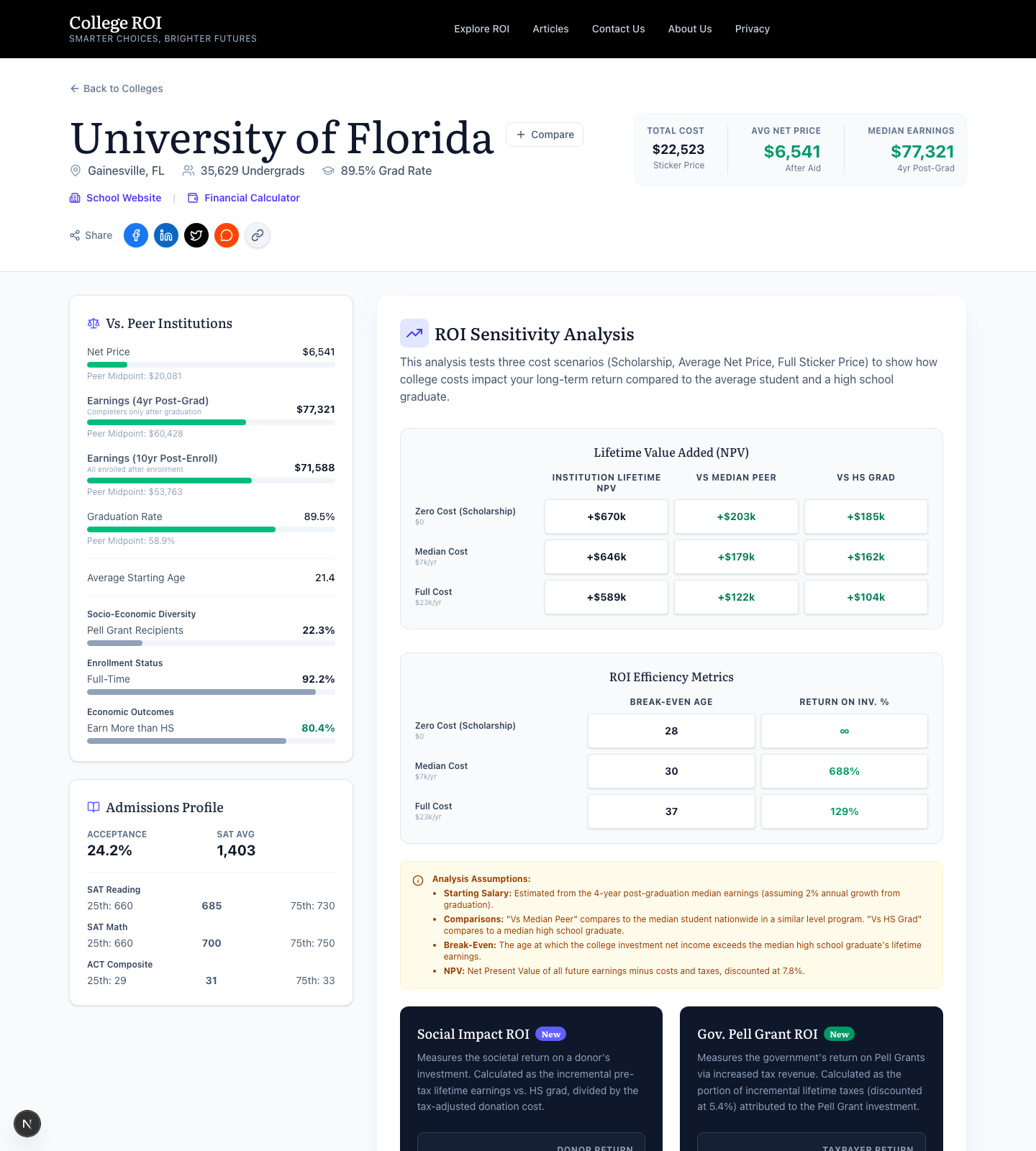
The Vs. Peer Institutions sliders on the left show four metrics on color-coded bars. Net price, four-year earnings, ten-year earnings, and graduation rate. The vertical line on each bar is the national median. Green is better than median. Red is worse. This is the fastest way to tell whether a school is delivering an above-average outcome at an above-average price, or some other combination.
The Lifetime Value Added matrix on the right is the heart of the page. It crosses three cost scenarios (zero, average net price, full sticker) with three outcome scenarios (top quartile, median, bottom quartile of student outcomes). The colored numbers show the NPV for each combination. If a row turns red as you move from zero cost to full sticker, that is the price at which the school stops paying back even for the median student.
The ROI Efficiency Metrics panel below it answers a different question. Not whether the degree pays back, but how fast it pays back. Lower numbers mean a faster payback.
Two newer sections at the bottom of the page reframe the same calculation for two different audiences. Social Impact ROI assumes a donor or scholarship grant covers the cost for one cohort and asks what that grant produces in incremental graduate earnings. Government Pell Grant ROI assumes the federal government invests $5,000 per year per student and asks whether the government recovers that investment through the additional taxes those graduates pay. Both are worth a look if you are weighing the case for funding higher education at a specific school.
Major pages
A major page is the same idea applied to a field of study.
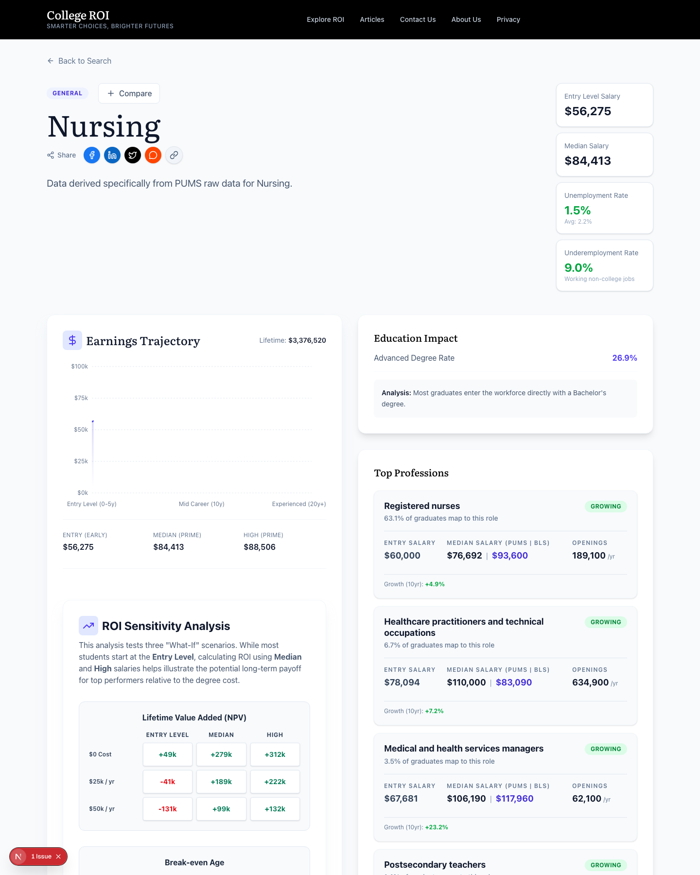
The top of the page shows the entry-level salary, the median salary, and two underemployment rates. The first underemployment rate is the share of graduates working in a job that does not require a college degree at all. The second is the share working in a job that requires a degree but not in their field. Together, those two numbers tell you what fraction of graduates from this major are using the credential they paid for.
The Earnings Trajectory chart shows three points across a working career. Entry level, mid career, and experienced. Some majors are flat after entry. Others compound. The shape of that line is at least as important as the entry number, and almost no other tool shows you the shape.
The Top Professions leaderboard ranks the actual occupations graduates of this major end up in, with the median salary for each occupation and a projected growth rate from the Bureau of Labor Statistics. If the top jobs in a field are shrinking, that is a labor-market signal you need to read.
The Top Institutions table at the bottom of the page ranks colleges by the NPV they deliver for graduates of this specific major. That ranking will not match any prestige ranking you have seen. That is the point.
State pages
State pages aggregate everything we know about higher education in one state, organized for someone making a regional decision.
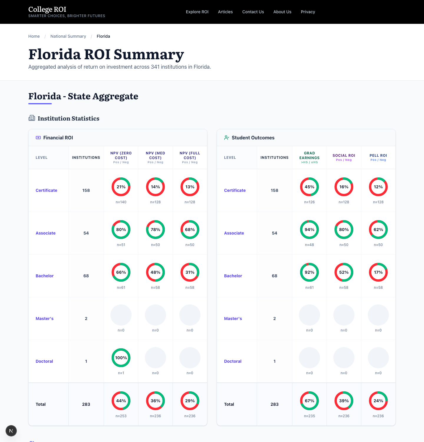
The Financial ROI table on the left shows, for each credential level offered in the state, the share of institutions that produce a positive NPV at zero cost, at average net price, and at full sticker. A row where the percentage drops sharply between average net price and full sticker is a row where price is doing all the work.
The Student Outcomes table on the right shows graduation rate, social mobility, and the share of students receiving Pell grants. Read the two tables together. A state with strong ROI numbers at low cost and high social mobility at high Pell share is a state where public higher education is doing its job.
The degree-level tabs above the tables let you filter for certificates, associates, bachelor's, and so on. Each tab re-runs the aggregates for that credential alone.
Compare matrix
The Compare button on any college or major page adds that item to a comparison drawer. Click Compare Now and you get a side-by-side matrix.
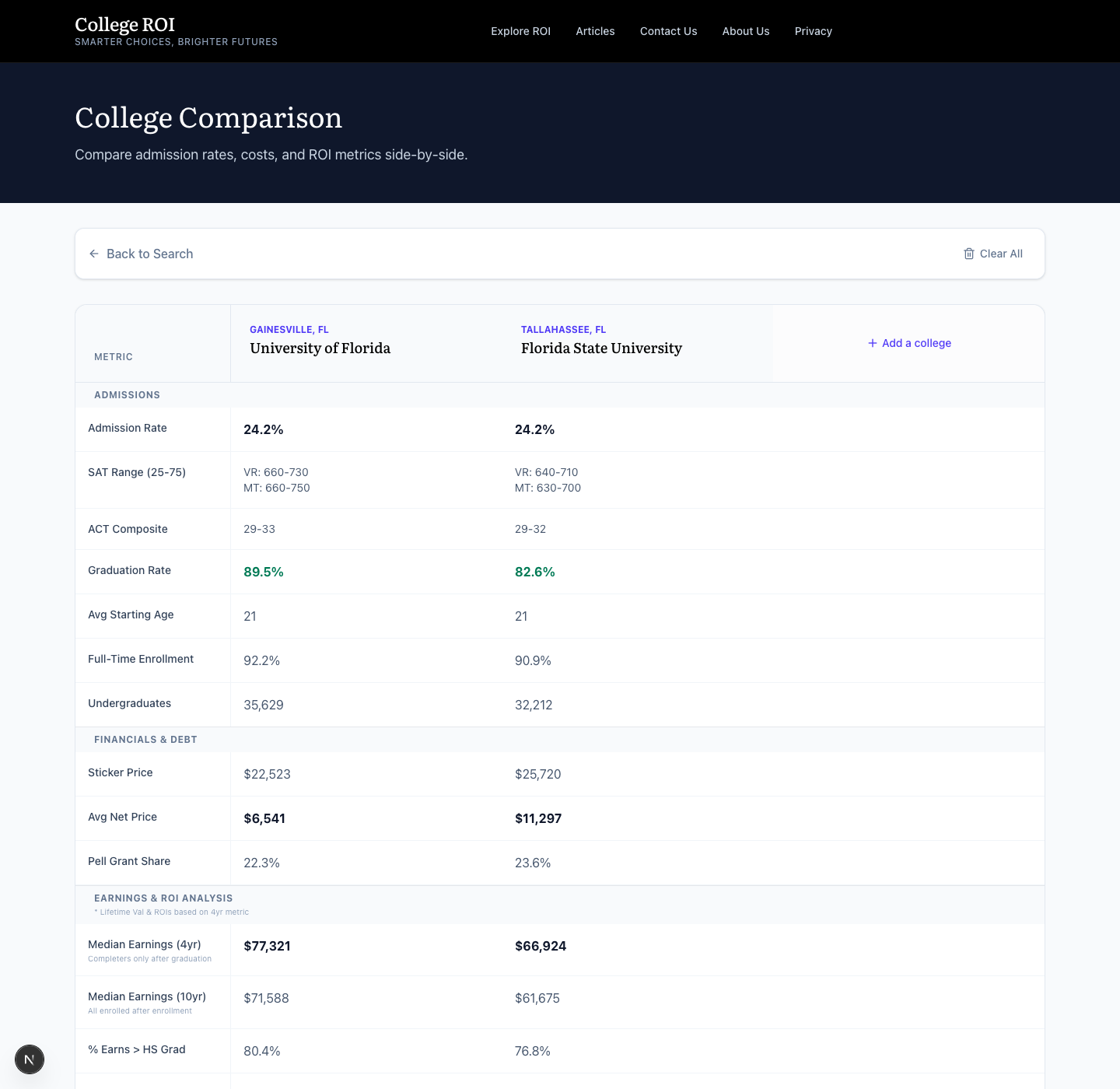
The matrix is grouped into sections: admissions, financials and debt, earnings and ROI analysis. The bolded numbers in each row mark the better value. For counselors and parents working with a short list, this is the fastest way to see where the trade-offs actually live. One school has a higher graduation rate. The other has a lower net price. The matrix puts both on the same page so the trade-off is visible instead of imagined.
The methodology in one paragraph
We discount future cash flows at 7.8%, grow wages at 2.0% per year, inflate tuition at 5.6% per year, and use 2025 federal brackets (or optionally 2026) plus FICA to compute after-tax earnings. State taxes are not included by default, and we expose only an optional flat-rate adjustment applied to gross income for users who want to stress-test the impact. We define Lifetime Value Added as the discounted present value of after-tax earnings minus all costs, compared to the baseline you chose. Break-even age is the age at which cumulative discounted earnings from the degree path exceed cumulative discounted earnings from the baseline path. Data on costs and outcomes comes from the College Scorecard. Earnings curves come from the Census Bureau's American Community Survey. Labor-market projections come from the Bureau of Labor Statistics.
Traps to avoid
Three mistakes show up in almost every family conversation we have about this tool.
The whole question of whether the degree was worth it disappears when both sides of the comparison already involve a degree. Set the choice context to First Higher Education Choice and force the model to answer the harder question.
Sticker price instead of net price, or net price instead of the actual offer. The number that drives the model is the dollar your family will actually pay. If you have the financial aid letter in front of you, use that number. If you do not, Net Price is closer to reality than Sticker Price for most students at most schools.
The four-year completer salary applies to the students who finished. If the graduation rate at the school is 50%, half the families who paid the tuition did not see the completer outcome. The Completion Premium on the institution card exists to make that risk visible. Look at it.
The tool is the starting point
The calculator answers a financial question. The decision is yours. Open the Guided Interview to run your family's scenario, or jump to a college or major page to start exploring.