Here is the oldest trap in investing. A stock has climbed for thirty years. The chart is beautiful, all climb, decade after decade. Everything in you says buy it. And the moment you do, you have bought none of that climb. Every dollar of it already went to somebody else. What you bought is the future, and the chart says nothing about that. Ask anyone who manages money for a living to name the most expensive mistake ordinary investors make, and you will hear this one. They buy the past.
Regulators consider the pitch behind this mistake so seductive that they did not leave the warning to good judgment. They wrote it into law. Any mutual fund that advertises its returns must carry the caution in the ad itself: past performance does not guarantee future results.[1]
Professionals go one step further than the warning. They split every track record into two parts before crediting anyone. Part one is the tide. A rising market lifts most of the stocks in it, and a manager who merely floated on that tide added nothing you should pay for. Part two is whatever the manager delivered above the tide.
Finance calls the tide beta and the added part alpha. The names are jargon, but the question underneath them is plain. How much of this record is the market, and how much is the manager? Often the honest answer is almost all tide.
Colleges are not mutual funds, and I want to be careful with the mapping. In finance, alpha is the return above what the risk alone should have paid. Colleges do not have a risk benchmark. They have something better, and more revealing. They have inputs.
Every school starts each year with the students it admitted, and those students arrive with test scores and preparation that predict a great deal of what happens next, and with family resources that shaped which schools they could reach. So the education version of the question is this. How much of a college’s advertised outcome is the students it selected, and how much is anything the college did? Same split, different benchmark. Keep that one adjustment in mind and the rest of the investor’s toolkit transfers cleanly.
The purchase with no prospectus
Now look at how a college sells itself. The outcomes page. The median salary of recent graduates. The employment rate at six months. The wall of famous alumni. Each one is the same sentence wearing different clothes: look what our graduates went on to do. It is a track record. It is precisely the pitch the SEC makes fund companies print a warning under. And for one of the largest purchases most families ever make, the pitch carries no such warning.
The college track record needs the warning more than the fund’s, not less, because it is loaded at the intake in a way a fund’s is not. A fund pays the market price for every stock it buys, so only the gains after the purchase count toward its record. A selective college starts each year with students it spent enormous effort hand-picking, and its record counts everything they carried through the door.
When a school admits an entering class with SAT scores in the top few percent of the country, drawn heavily from families with resources to match, and later reports that its graduates earn a lot, it has proven one thing beyond all doubt. Its admissions office works. Whether the school added anything to those students is a question the headline number cannot answer, because the ingredients were chosen to produce it.
I looked at the individual version of this question in an earlier piece.[2] A graduate’s premium can come from what the degree taught her, from the hiring screen it got her past, or from who she already was, and a snapshot of earnings cannot say which. This is the same question one level up, and here there is better evidence. The outcomes belong substantially to the students. The school reports them as its own.
Now run the decomposition on the most selective schools. They operate a great deal like the world’s most expensive index funds. They buy the top slice of entering talent, hold it for four years, and charge active-management fees on performance most of that talent would have delivered anyway.
Mostly. Not always. The exception matters more than the rule here. Dale and Krueger, researchers who spent years untangling exactly this question, found that students admitted to selective schools who attended less selective ones went on to earn about the same as those who enrolled.[3] For most students, the selective name added little that the student did not bring.
That result also answers the sharpest defense of the price, which is the network. If the network were the product, the students who turned the offer down should have paid for walking away in lost earnings. Outside the exception below, their typical earnings show no such cost.
But for two overlapping groups the finding changed. In the first study, students from lower-income families gained more from the selective school. In the follow-up that tracked earnings for up to 25 years, students whose parents had less schooling kept a large gain.
Follow the money before crediting the teaching. Schools like Penn meet full financial need, so a talented low-income admit attends nearly free, and free transforms the return. That reading is my book’s, not Dale and Krueger’s. Most of the return runs through the gift: an education the family could never have bought, delivered at almost no price.
Run the same split on a different student and you get a different answer. For the well-resourced admit, the elite outcome is mostly beta. For the constrained admit, the earnings gain is real, and the largest part of the return is the price. Run the split and it does more than say whether a school pays. It tells you where the payoff comes from. And keep that mechanism in mind, because the schools in the next section produce the same low price the ordinary way, with sticker prices low enough that aid covers most of the bill.
Where the alpha is
Turn the logic around and it points somewhere the glossy track records never do. If outcomes are inputs plus value added, then the clearest evidence of value added comes from schools that start with students the selective schools passed over. They take lower test scores and modest family money and deliver solid careers anyway. Far less of that performance is borrowed from advantage. There is much less tide to credit. That is where the alpha shows, and few buyers are pricing it.
You do not have to take my word that such schools exist. The detectors are already built, and they are public.
The first is mobility. Raj Chetty and his colleagues, now the Opportunity Insights team at Harvard, tracked millions of students and published, college by college, a mobility rate: the share of a school’s students who arrive from the bottom fifth of family income and reach the top fifth of earners as adults.[4] Read it as a first screen for alpha, not a verdict. The researchers say their numbers do not measure what a college causes, and they call the standouts colleges that “deserve further study.”
Some of what it catches is still the students. Drive is not limited to families with money, and ambitious students pick these schools on purpose. But the advantages that load the elite track record, the test scores and the family money, are far weaker here. Whatever moved these students, the school and the students earned it together, and little of it was bought on the way in.
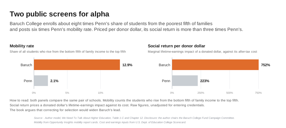
The standout results in that data came out of public workhorses, and in my book I put one of them, Baruch College of the CUNY system, next to the University of Pennsylvania. Baruch’s mobility rate is about six times Penn’s.[5]
Most of that gap is access, who gets in the door. Baruch draws about 28 of every 100 students from the poorest fifth of families, Penn fewer than 4.[4] Of the students who arrive poor, 58 in 100 of Penn’s reach the top fifth, and 47 of Baruch’s, with entering test scores well below Penn’s.[4][5] Neither number isolates what the school added, but the share who rise is where to look.
A disclosure belongs here, before the next number. Baruch is my alma mater, and I chair the Baruch College Fund Campaign Committee. I ran the model before I took that role, and its inputs are public, so you can check every step.
The second is a measure I built in the book for donors, and it prices what mobility finds: the marginal social return per dollar given to a school. Baruch’s low costs mean a donated dollar funds several times the students it would fund at an elite school. And the graduates it launches come out hundreds of thousands of dollars ahead of a high-school baseline in lifetime earnings. The result is a 752 percent social return per Baruch dollar against 223 percent at Penn.
Those are raw numbers, and the book says so. It also argues, from the Dale and Krueger evidence, that adjusting for who each school admits should cut the elite figure faster than Baruch’s, widening the gap rather than closing it. The raw derivation is in Chapter 12, and anyone can check the arithmetic. Mobility points to where the alpha may be. Social return prices it.
The third detector answers the question a family actually faces, which is not abstract at all. Is this specific school, at this specific price, worth it for this specific program? My College ROI model was built for exactly that question.[6] It starts from the same outcome data, so it carries the same caveat about who enrolled. What it adds is what the outcomes page leaves out: your price, and the high school baseline you are paying to beat.
Employers, as it happens, have been slow to read these detectors too. My book’s employer chapter shows many of the biggest national firms recruiting mostly at beta schools and passing over schools that graduate strong candidates at a fraction of the cost per graduate.
The capable candidates, as the chapter puts it, “are not scarce. They graduate from the schools the elite recruiting map rarely visits.”[7] The market is still learning to price these graduates correctly. Until it does, a school that builds them at a fraction of the elite price has another name. A bargain.
The forward thesis
Good investors do one more thing after they stop buying the past. They build a thesis about the future before they commit a dollar. Not what did this fund return, but why should it return anything going forward? A family can do the same for a college with one question. What does this school do to the student it actually admits, and will that hold for mine?
The thesis breaks into questions a family can ask.
Who really enrolls here? Look at the entering class profile: the test-score range and the share of students on need-based aid. Not the acceptance rate. The acceptance rate measures the crowd at the door. The entering class tells you the inputs behind the outcomes you are being shown.
What happens to students who arrive like my child? A school’s median outcome describes its median graduate. If your child’s preparation and circumstances sit far from that median, the headline describes someone else.
Does the school show value beyond its filter? Mobility rate is public. So are graduation rates, and some schools break them out for students like yours. A school that moves students upward from modest starts has real evidence of alpha to show. A school that cannot say what it adds beyond its selectivity is asking you to pay active fees for an index.
And one question runs on the family itself. If money is tight and your child is talented, the Dale and Krueger exception is about you, and it is good news twice over. The evidence says the selective school tends to pay for students like yours, and schools like Penn promise to meet full need, which can make attending nearly free. If money is comfortable, the same evidence says the elite record is mostly beta for your child, and price discipline matters more than the name.
None of this ranks students, and none of it disparages any school. Entering test scores are circumstances, not verdicts on a child’s worth. The point is smaller than that, and more useful. A track record built on chosen inputs cannot tell you what the chooser added, and you are not buying the track record. You are buying the next four years, for one specific student, at one specific price.
The SEC answered its version of this problem long ago with a mandated legend, and its core is one sentence. Past performance does not guarantee future results. I have never seen a college viewbook print it. Until one does, families have to supply the warning themselves. Read the track record. Then ask who earned it.
Reference Sources
- U.S. Securities and Exchange Commission. Rule 482, 17 CFR 230.482(b)(3)(i): performance advertisements must carry a legend disclosing “the performance data quoted represents past performance; that past performance does not guarantee future results.” Rule 156 (17 CFR 230.156) separately treats portrayals of past performance “made in a manner which would imply that gains or income realized in the past would be repeated in the future” as potentially misleading sales literature. Accessed July 30, 2026. SEC, Amendments to Investment Company Advertising Rules, Release 33-8294 (2003). Accessed September 28, 2026.
- Shivamber, Leon. “The $24,000 Row.” collegeroi.org, August 2026. The individual-level version of the same question: a snapshot of earnings cannot tell whether a graduate’s premium came from the degree or from the person.
- Dale, Stacy B., and Alan B. Krueger. “Estimating the Payoff to Attending a More Selective College: An Application of Selection on Observables and Unobservables.” NBER Working Paper 7322 (1999), and “Estimating the Return to College Selectivity over the Career Using Administrative Earnings Data.” NBER Working Paper 17159 (2011). Accessed July 30, 2026.
- Chetty, Raj, John N. Friedman, Emmanuel Saez, Nicholas Turner, and Danny Yagan. “Mobility Report Cards: The Role of Colleges in Intergenerational Mobility.” NBER Working Paper 23618 (2017), published as QJE 135(3) (2020). Accessed July 30, 2026. Over 30 million college students, 1999-2013. Mobility rate defined as “the fraction of students who come from families in the bottom income quintile and reach the top quintile.” College figures from table mrc_table2, the college-level mobility table. Students born 1980 to 1982, earnings measured in 2014 (see the table’s codebook).
- Shivamber, Leon. We Need To Talk About Higher Education, Chapter 1, Table 1-C (mobility rates 12.9% vs 2.1%) and the selection argument (correcting for selection “shrinks Penn’s premium faster than Baruch’s”), and Chapter 12, “Why Big Donors Prefer Elite Schools” (derivation of marginal social return per donor dollar: 752% Baruch vs 223% Penn). Chapter 12 also carries the author’s disclosure that he chairs the Baruch College Fund Campaign Committee, with the model built before the role.
- Shivamber, Leon. College ROI model, collegeroi.org.
- Shivamber, Leon. We Need To Talk About Higher Education, Chapter 14, “Why Big Employers Recruit at the Wrong Schools.”