Look up a college in the ROI rankings from Georgetown’s Center on Education and the Workforce, or CEW, and read across to the forty-year column, the one people tend to quote. You will find a comforting number. Positive. At least six figures. Usually seven. That is not a coincidence in the data. Sort their most recent table by that column, all 4,476 institutions, and the lowest number in it is positive $361,000. There is no negative anywhere in the forty-year column.[1] A parent scrolling the table sees a college showing $500,000 and reasonably concludes the school pays back its cost with half a million dollars to spare.
That reading is correct as far as it goes. The problem is where it stops. The table almost never tells you the one thing an investor would demand to know before trusting any return: compared to what?
I ran the test on my model of 1,679 bachelor’s-granting colleges, built from the government’s own College Scorecard data. Each school keeps the starting salary and wage growth my model already gives it. I changed only the accounting, to match the league tables’ basic construction: forty years of earnings, minus four years of cost, and nothing else. No comparison path, no taxes, no time value. The published versions vary. Some add a comparison path or discount the future, and the CEW is even more conservative than my version, holding earnings flat after year ten. But none of the popular tables I have found restores all three of the missing pieces, and those three carry most of the collapse. On that accounting, every single institution comes out positive. All 1,679 of them, at full sticker price and at the typical price after aid.[2] One hundred percent.
A metric that returns the same verdict for every school cannot be measuring whether any of them beats the alternative. And yet that positive sign is exactly what a reader takes away from the table.
You can watch the window do this inside Georgetown’s own numbers, without any of my arithmetic. They publish five columns for each school, the return at ten, fifteen, twenty, thirty, and forty years. Walk across them for their most recent year of data.
At ten years, fifty-two schools are negative. The Pennsylvania Academy of the Fine Arts sits at negative $157,000, the Manhattan School of Music at negative $134,000, Berklee at negative $110,000. At fifteen years, exactly one school in that year’s table is still negative, the Manhattan School of Music, at negative $5,000. The next school up is already positive. At twenty years there are none at all, and the lowest number in the table is positive $124,000. At thirty it is positive $271,000. At forty, positive $361,000.[1]
Same schools, same students, same data, five different verdicts. Nothing about those institutions improved between the columns. The negatives were not fixed. They were outrun, by a window that keeps growing against a cost that stays fixed at one to five years. Long enough, and the sign stops carrying information about the school at all.
Here is what the construction asks: are forty years of earnings bigger than four years of cost? The answer is yes for every college, because forty years of almost any working life is bigger than four years of almost any bill. The question the table answers is real, and the researchers who build these tables are answering it honestly. It is simply not the question a family standing at the decision is asking. The family wants to know whether this path beats the path their child already has, the one that costs nothing to choose: go to work.
To see how much that missing comparison matters, follow one school through the arithmetic. Take a private university charging about $50,000 a year at full cost, whose median graduate earns about $58,000 four years after graduation. In the CEW’s 2025 table, this school shows a forty-year ROI of about $1.7 million, which places it comfortably in the top third of their whole table and right at the middle of the four-year schools in it.[1] Their construction sums earnings from years six through ten after enrollment, holds real earnings flat from year ten onward, subtracts five years of average net price, and applies a discount rate of zero.[3] On my league-style accounting, with wage growth included, it shows roughly $3.1 million.[4] The constructions differ, but they share the property that matters: a number that size does not look like a warning. It looks like a rounding error away from a guarantee.
Now add what the table left out, one step at a time.
First, the comparison. Put both paths on one full working lifetime, ages eighteen to sixty-five. That alignment hands the college side about $350,000 more of late-career earnings than the league-style forty-year window counted, so the window is doing no work against the school. Then subtract the path the student already had: a high school graduate who goes to work at eighteen earns about $2.76 million over those same years, before taxes.[4] The school’s league-style number collapses to about $676,000. The go-to-work path earns roughly eighty cents of every dollar the college path nets over a lifetime, and the student owned that path before anyone mailed an acceptance letter.
Second, taxes. The earnings advantage a degree produces is the top slice of income, and the top slice is where the tax rates live. Run both paths through federal income and payroll taxes and about $259,000 of the remaining premium goes to the government before the graduate touches it. The advantage is down to roughly $418,000.
Third, time. Every dollar of cost and all four years of forgone earnings happen at ages eighteen to twenty-two, at full weight. The premium arrives mostly in the graduate’s forties and fifties, and a dollar thirty years away is worth about a dime today. Discount both paths the way you would discount any forty-year investment and the advantage does not shrink. It flips. The school that showed seven figures in the ranking leaves its median graduate about $149,000 behind the high school path at its full price, and about $67,000 behind at its net price, the same kind of price the CEW uses.[4] My book walks this same collapse for the median four-year college in Chapter 3, and takes the published studies apart one by one in its appendices. The point here is narrower: the ranking and the verdict point in opposite directions.
Positive seven figures in the table. Negative against the alternative at full price and at the typical price after aid.
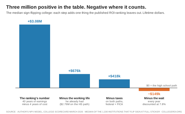
This is not one unlucky example, and it is not a cherry-picked one. The school’s league-style figure sits at the exact median of the 1,330 institutions that flip, and the typical one of them still ends about $120,000 behind the high school path at full price. The CEW’s own table, remember, places it in their top third overall and at the middle of its four-year peers. Across my model’s 1,679 institutions, 1,330 of them, seventy-nine percent, are behind the high school path at full sticker price once the comparison, the taxes, and the time value are counted. At the typical price families pay after aid, 967 institutions, fifty-eight percent, still are.[2] Every one of those schools shows a positive number in a league-table construction, and the median league-table figure among them is about three million dollars.[4] A reader cannot tell the winning colleges from the losing ones by the table’s verdict, because that verdict is positive for all of them.
You do not have to take my model’s word for the direction of this. In 2025 the CEW updated their rankings, and the update makes it possible to run the comparison inside their own numbers, with no discounting anywhere. Their College Payoff report puts a full-time high school worker’s lifetime earnings at about $1.6 million. Set their rows against that figure and about two-thirds of ranked institutions fall at or below it, though most of those are certificate and two-year schools, and among four-year schools it is just over a third. It is a rough bar: the lifetime figure counts only full-time, year-round workers aged 25 to 64, and their rows count part-time earnings too.[5] Before a single dollar of time value enters, the baseline changes the story for a large share of the table. And if you suspect my 7.8 percent discount rate is carrying the arithmetic above, run it gentler. At 3 percent, the example school climbs back above water, but 525 institutions, nearly a third, stay behind the high school path at full price, and 235 stay behind even at zero cost.[6] The rate moves the count. It does not repeal the comparison. My book defends the rate itself in its closing chapters.
There is a fourth omission. It moves the numbers less than the first three, and it matters more, because it is the only one that is a risk rather than an arithmetic correction.
Everything my model priced above is the ledger of a student who graduates. The CEW’s earnings figures do fold in students who left, but its table does not price the path of the student who pays for part of a degree and never finishes. At the median four-year college, about four in ten who enroll do not finish there within eight years, and many of them pay for part of a degree without ever collecting it.[7]
So price that too. Weight each school by its own completion rate, charge the student who leaves for two years of cost and two years of forgone wages, and run the same comparison on the 1,656 colleges that report an eight-year completion rate. At full sticker price, on a middle assumption about students who transfer out, the share of four-year colleges where enrolling, on average, leaves a student behind the high school path rises from 79 percent to 85. At the price families pay after aid, from 57 to 65. And at a cost of zero, with every dollar of price erased, a third of them are still behind.[7]
Hold that last one next to the free-college argument. A price of zero still leaves a third of these schools short. For most of them the graduates’ own earnings fall short of the high school path, and the students who never finish add the rest.
I want to be precise about who this criticizes, because the answer is almost no one. The researchers who build these tables document their methods and answer the question they pose. Some discount and subtract a comparison path, some adjust for cost, and the CEW has revised their methodology across versions. What none of the popular tables I have found do is all four at once: subtract the alternative path, net out taxes, price the wait, and price the chance the student never finishes, and then say plainly what the number means against the choice a family faces. The harm is not in the research. The harm is in the reading: a wall of positive numbers that looks like a menu of good investments, when most of the menu, read against the default path, is not.
So here is the habit, and it takes one question. Whenever anyone shows you a return, on a college, a program, anything, ask: compared to what? If the answer is “compared to four or five years of cost and nothing else,” you have learned that forty years of pay beat a few years of bills, which was never in doubt and is not the bar. The bar is the life your child would build anyway. My model runs that comparison, after costs, taxes, forgone years, and time value, for nearly every bachelor’s-granting college and major in the country, free, at collegeroi.org. The full method, and every assumption behind it, is documented line by line in my book.
A positive return is not the same thing as being better off. The difference between those two ideas is worth exactly as much as the comparison the rankings leave out. For the median four-year college, at the price families actually pay, it is worth the whole verdict.
Companion Pieces
- The Doubt Everyone Explained Away
- The Study That Got Halfway There
- College Is a Bet, and No One Shows You Your Odds
Reference Sources
- Cheah, Ban, Martin Van Der Werf, Catherine Morris, and Jeff Strohl. “Ranking 4,600 Colleges by ROI (2025).” Center on Education and the Workforce, Georgetown University, February 26, 2025. Accessed July 25, 2026. Institution-level rows read from the report’s public interactive table (data file: https://cewgeorgetown.github.io/roi-all/roiall.js), filtered to the most recent data year, 2021–22, which returns 4,476 institutions out of the 42,318 institution-by-year rows the table holds. Sorting that filtered table ascending on each ROI column gives the lowest value in each: negative $157,000 at ten years, negative $5,000 at fifteen (the Manhattan School of Music, the only institution still negative at that horizon), positive $124,000 at twenty, positive $271,000 at thirty, and positive $361,000 at forty. Fifty-two institutions are negative at ten years. For the example institution: 40-year ROI $1,740,000 in 2023 dollars, with 10, 15, 20, and 30-year values of $124,000, $394,000, $663,000, and $1,201,000. On the forty-year column, that $1,740,000 is higher than three-quarters of the 4,476 institutions and just below the median of the 1,682 predominantly bachelor’s institutions, which is $1,743,500. Earlier years for the same institution range to $1,874,000.
- Author’s model, 1,679 bachelor’s-granting institutions, built on U.S. Department of Education, “College Scorecard Data.” Institution-level file, March 2026 release. Accessed July 5, 2026. League-style accounting applied to the model’s own earnings engine: 40 years of pre-tax graduate earnings (starting salary back-solved from median earnings four years after graduation, 2 percent annual wage growth) minus four years of cost, with no baseline comparison, no taxes, and no discounting. On that accounting, 1,679 of 1,679 institutions come out positive, at full sticker and at median net cost. The model’s own comparison is a different calculation: net present value against the high school path after costs, federal income and payroll taxes, forgone earnings, and a 7.8 percent discount rate. On that basis 1,330 institutions (79.2 percent) and 967 (57.6 percent) fall behind the high school path at full sticker and median net cost respectively. The Department published a newer Scorecard release on June 10, 2026, so a reader pulling today’s file will see small differences at individual institutions. Every figure here is from the March vintage. Run any school at collegeroi.org.
- Cheah, Ban, Martin Van Der Werf, Catherine Morris, and Jeff Strohl. “College ROI FAQs.” Center on Education and the Workforce, Georgetown University, 2025. Accessed July 25, 2026. The construction in the authors’ own words: “We calculate ROI at intervals of 10, 15, 20, 30, and 40 years following initial enrollment at an institution. The ROI is the cumulative sum of earnings minus the total out-of-pocket costs based on the average net price,” charging a predominantly bachelor’s institution “average net price x 5.” On the horizon: “For horizons longer than 10 years, we assume that real earnings continue to be the same as in year 10 (i.e., we assume no growth in earnings after year 10).” On discounting: “For the current version of this data tool, we use a discount rate of zero percent. In other words, we do not discount future cash flows.” The formula subtracts no high school baseline and applies no taxes.
- Author’s model, median institution among the 1,330 that flip sign at full sticker: league construction $3,082,135. Minus the high school counterfactual ($2,755,586 pre-tax over the same ages-18-to-65 window) leaves $676,350. After taxes on both paths $417,735. Discounted at 7.8 percent, −$148,922 versus the high school path. Medians across all 1,330 flipped institutions: $3,082,135 → $676,549 → $426,470 → −$120,639. At the example institution’s net price ($27,715, the CEW’s kind of cost basis), the model’s result is −$66,994 versus the high school path. At zero cost, +$32,739. Window note: the league figure runs the tables’ 40-year convention. The waterfall’s later steps run both paths on the model’s full 18-to-65 window, which adds $349,801 of late-career earnings to the college side before the subtraction (college lifetime pre-tax $3,651,468 less cost $219,532 gives $3,431,936, against the league figure of $3,082,135). The alignment favors college, so the collapse is not an artifact of window choice.
- Georgetown University Center on Education and the Workforce, 2025 ranking update, on its own zero-discount basis, using the 2021–22 data-year cut of 4,476 institutions described in note 1 (data file: https://cewgeorgetown.github.io/roi-all/roiall.js). The high school baseline is the $1.6 million lifetime figure the CEW’s College Payoff report gives for high school graduates working full-time, full-year from ages 25 to 64 (about $40,000 a year over 40 years). The ranking’s earnings come from the College Scorecard and include part-time work, so the two figures do not share a basis. 1,494 of 4,476 ranked institutions (33 percent) sit above it, two-thirds at or below, and the median institution’s 40-year value is approximately $1,405,000. Among the 1,682 predominantly bachelor’s institutions, 614 (36.5 percent) sit at or below it, and their median, $1,743,500, sits above it. Detailed reconstruction and sourcing in the author’s book, We Need To Talk About Higher Education, Appendix B.
- Author’s model, 3 percent discount sensitivity, run July 5, 2026: institutions behind the high school path at a 3 percent rate: 525 of 1,679 (31.3 percent) at full sticker, 359 (21.4 percent) at median net price, and 235 (14.0 percent) at zero cost. The example institution is above the baseline at 3 percent (about +$31,000 at full sticker). The rate itself is defended in A Degree Is Not a Treasury Bond and in the book’s closing chapters.
- Author’s model, completion-weighted return to ENROLLING as distinct from the return to graduating reported above. Universe: 1,656 bachelor’s-granting institutions carrying an eight-year completion cohort. Each institution’s outcome is the probability-weighted average of finishing and not finishing, using its own completion rate from the College Scorecard. The median institution in this set graduates 59.3 percent of its entrants within eight years at the institution they started at. The student who does not finish attends two years, pays two years of cost, gives up two years of earnings, and then earns the some-college wage, taken from Bureau of Labor Statistics, “Education pays.” U.S. Bureau of Labor Statistics, Table 5.1, 2024 data, as archived August 24, 2026. Median usual weekly earnings of $1,020 for some college and no degree against $930 for a high school diploma, a premium of 9.7 percent. Because the federal measure counts finishing at the original institution only, the result is bracketed. A floor that credits no unobserved student with a degree puts 89.3, 74.0 and 41.3 percent of institutions behind the high school path at full sticker, median net and zero cost. A ceiling that credits every one of them puts it at 79.2, 57.3 and 29.3. The figures in the text are the central case, which credits the students the federal data records as status unknown but not those it records as having enrolled at another institution, some of whom may have finished there: 84.8, 65.1 and 33.9 percent. Running the same machinery with the weighting switched off gives 79.0, 57.2 and 29.1 percent on these 1,656 institutions, within a point of the model’s published figures across all 1,679 in note 2, which is the check that the calculation is sound.
Further reading: the per-study critiques of Georgetown’s two reports, IHEP, and the New York Fed appear as separate pieces on collegeroi.org, with the umbrella audit at “Auditing the Numbers That Say College Pays.” The institution-level results come from the author’s own model. You can run the return on any school and major at collegeroi.org.